Obe Power
Real-time EV charging discovery, booking and payment — for drivers, hosts and network admins.
Understanding the Context
What was happening, who it affected, and why the project mattered.
Project Context
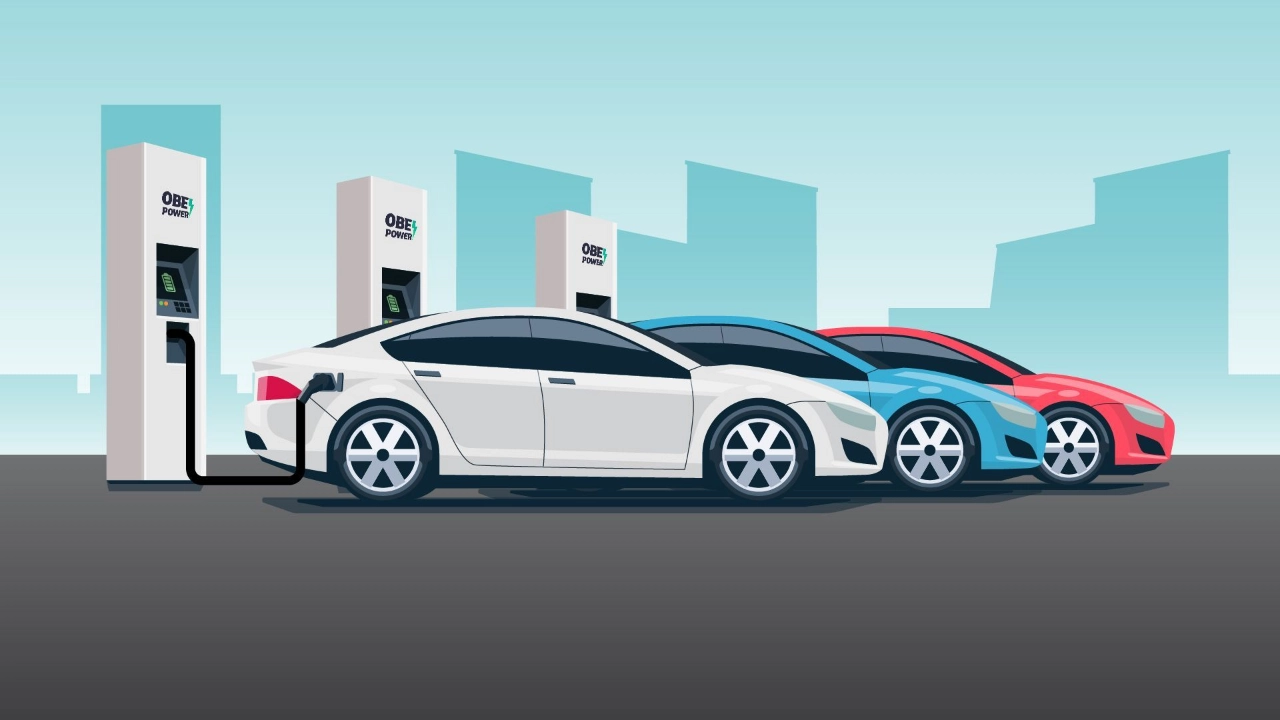
Obe Power was building an EV charging network — physical stations plus the software layer connecting drivers, station hosts and network admins. As the network grew, the product needed a driver-facing experience good enough to earn trust in a still-new category, and operational tools solid enough to convince investors the business could scale.
Existing Experience
Finding a working, available EV charging station was a mess of fragmented apps, unclear pricing, and no live data — drivers had no way to know if a spot was actually free until they got there.
The Challenge
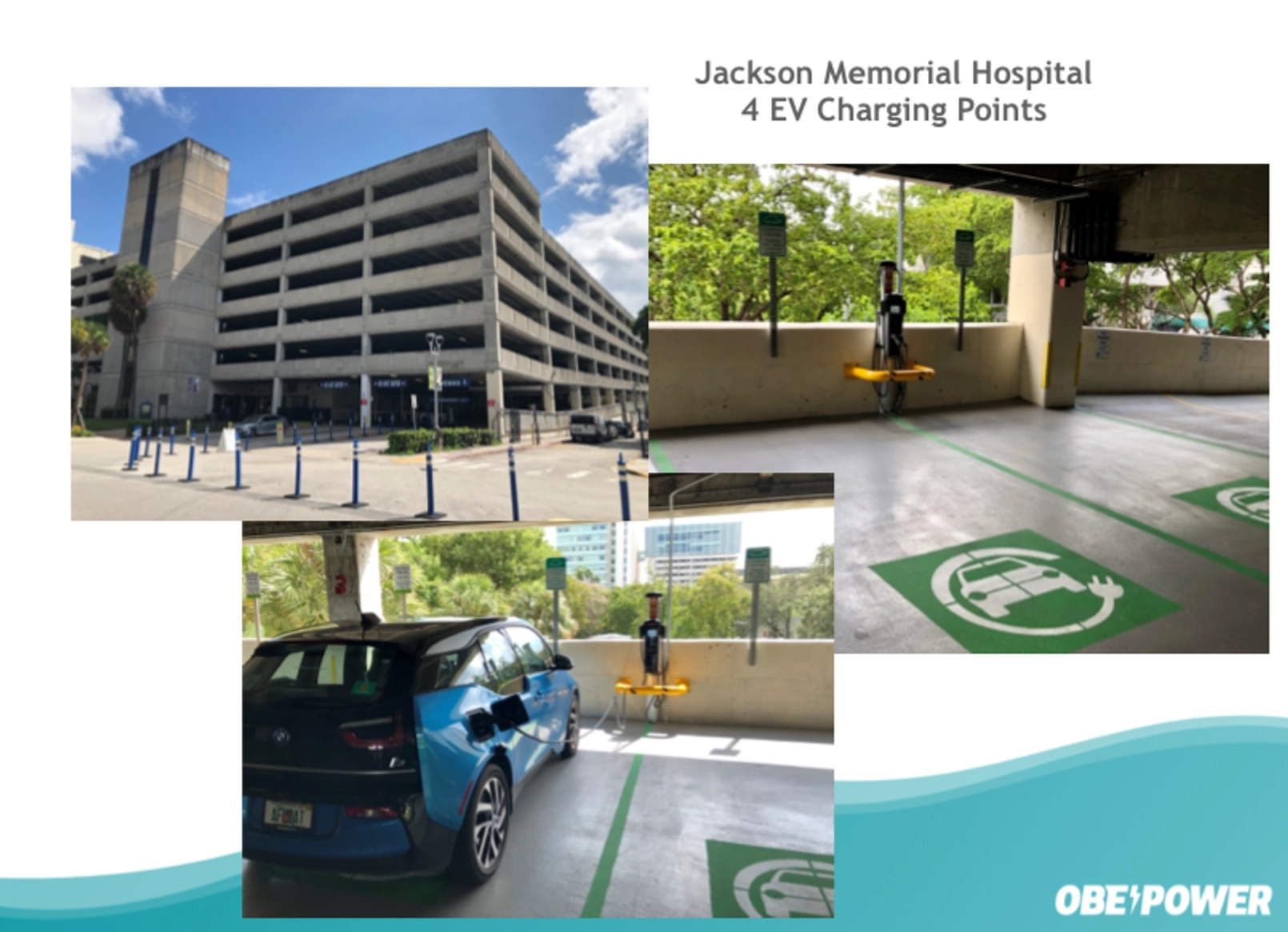
Field research at an OBE charging station and interviews with both regular and occasional drivers surfaced the real friction: occupied spots with no warning, private-vs-public confusion, and range anxiety on longer trips.
User Problems
Drivers arrived at stations with no way to know if a spot was actually occupied.
Public and private charging spots were easy to confuse, causing wasted trips.
Range anxiety on longer trips wasn't addressed by any existing app.
Booking, payment and account details were fragmented across separate apps.
Supporting Visuals
Defining What Needed to Change
What I was responsible for solving, and what success needed to look like.
Design Challenge
My Role
As UI/UX Designer, I designed the full loop across three connected surfaces — the driver app, the host portal, and the network admin portal. I led field research at an OBE charging station and interviews with regular and occasional drivers, then took those findings into real-time station search, QR-code booking, a car-aware onboarding flow, and a trip planner that surfaces charging stops along a route automatically.
Goals
Give drivers live, trustworthy station availability.
Personalize range estimates to the driver's exact vehicle.
Make booking and payment a single, one-tap flow.
Extend one consistent design system across the app, host and admin surfaces.
Reduce design debt and rework as the network scaled.
Constraints
- Three distinct user types — drivers, station hosts, network admins — on one connected system
- Live, real-time station and availability data
- Multiple platforms: iOS, Android, and two web portals
- Early-stage startup timeline, running alongside an active fundraise
Success Criteria
- Live station data drivers could actually trust
- One-tap booking and payment
- Consistent experience across app, host and admin surfaces
- Measurably less design debt and rework across the three surfaces
- A product credible enough to support the funding pitch
Designing the Experience
What I actually did — from mapping the fragmented booking flow to shipping the final experience.
Understanding the Workflow
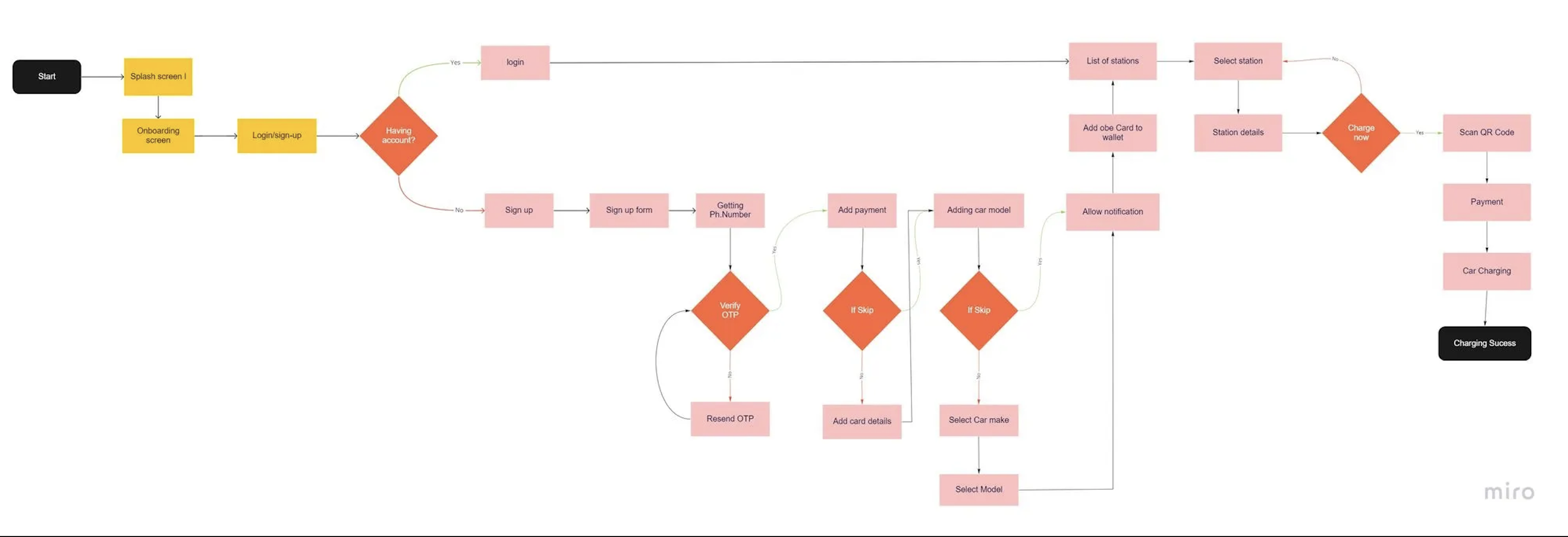
Before designing anything new, I mapped how drivers actually found and used a charging spot today — juggling multiple apps, guessing at availability, and paying through yet another app once they arrived. That fragmented, multi-app reality was the real competitor, not any single existing tool.
Exploring the Experience
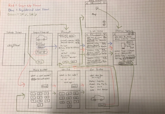
I explored a few different ways to surface live availability — a list-first view, a map-first view, and a hybrid that kept the map but surfaced a ranked list underneath. Early wireframes helped test how each held up once real-time status and multiple nearby stations were on screen at once.
Key Design Decisions
From Static Listings to Live Availability
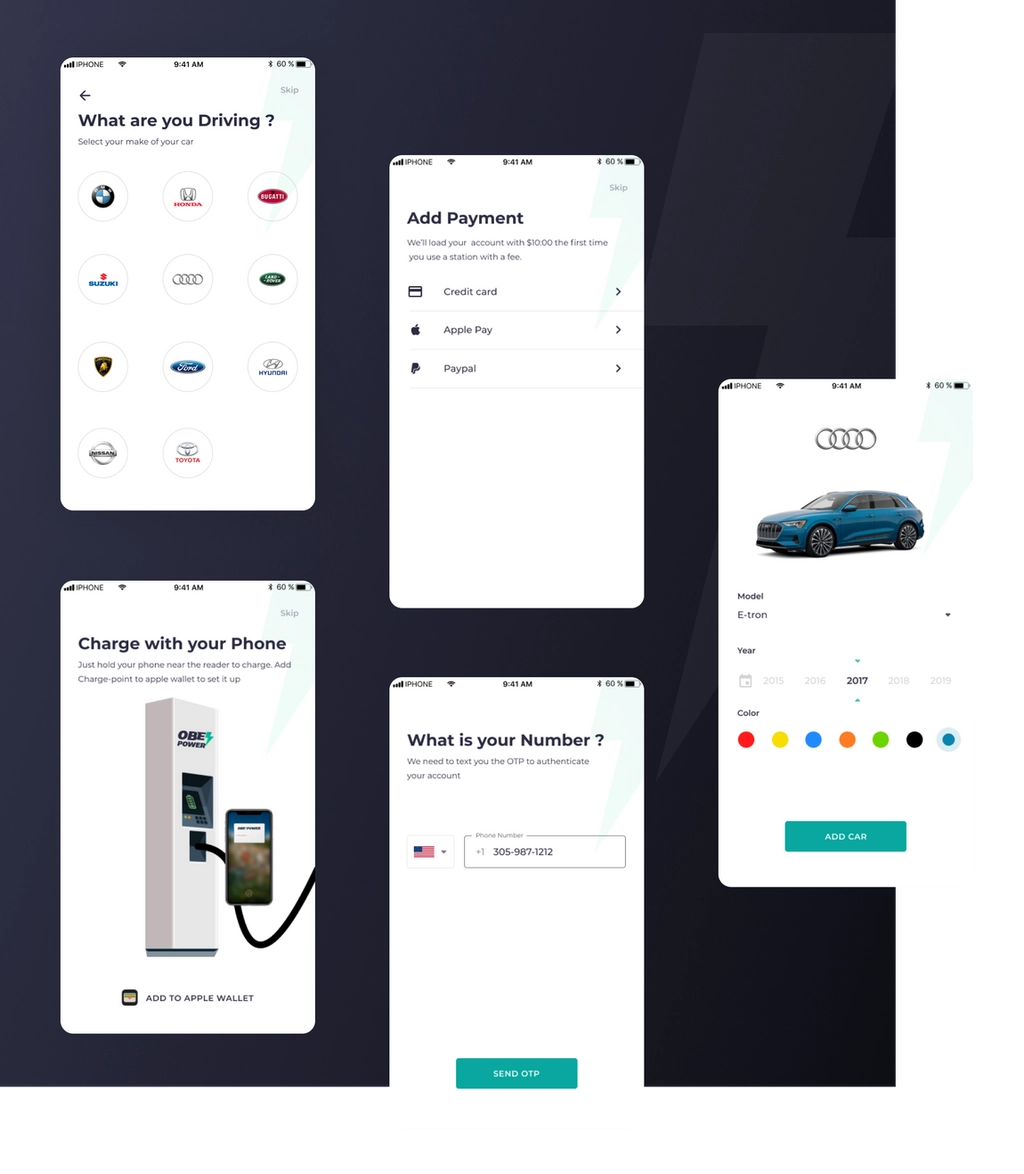
Car-Aware Onboarding
One Account, Three Surfaces
The Final Experience
The shipped booking and trip-planning experience, closing the loop from reservation to route.
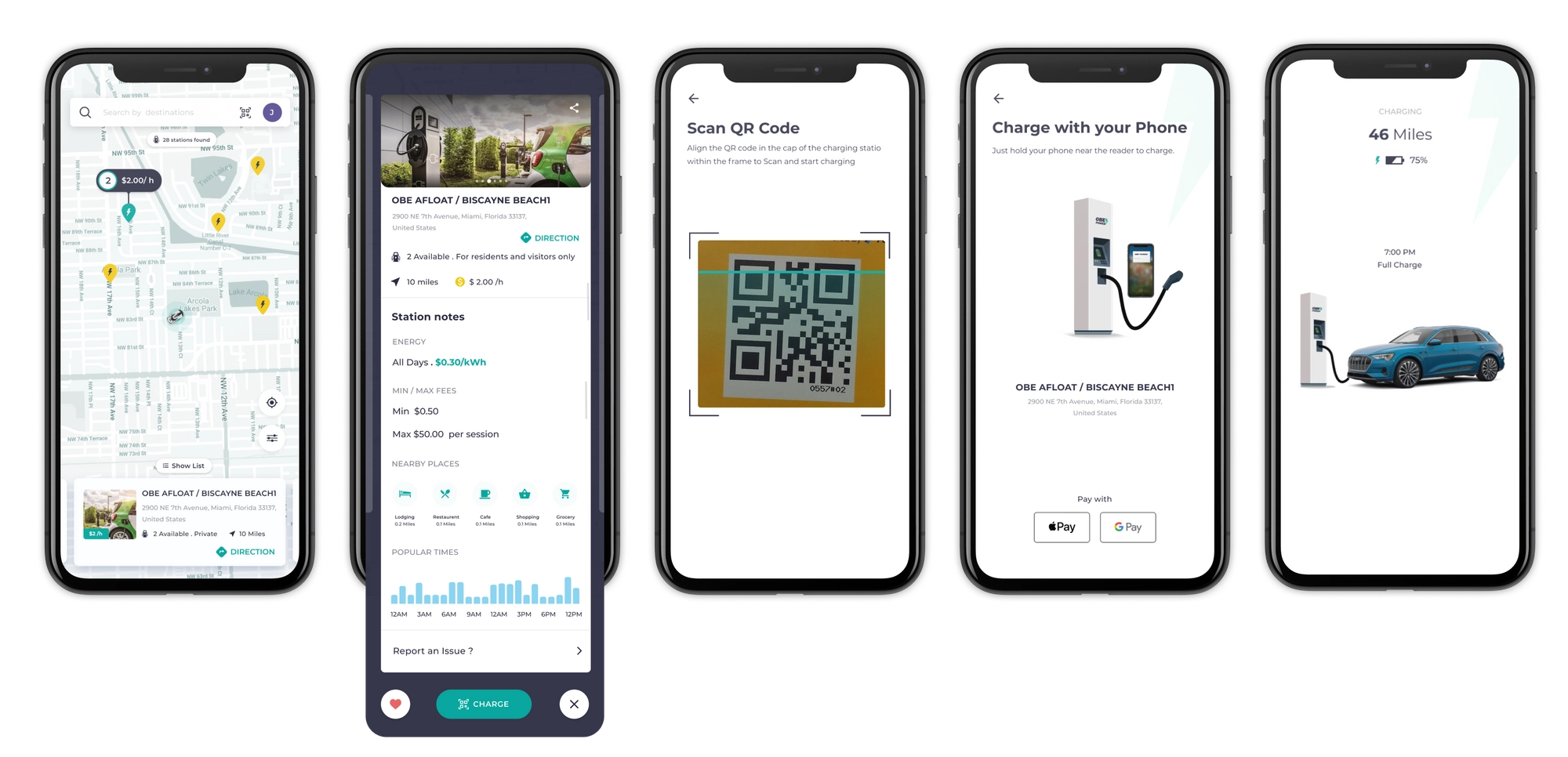
Book & Pay
QR-code booking and one-tap Apple Wallet payment close the loop without ever leaving the app.
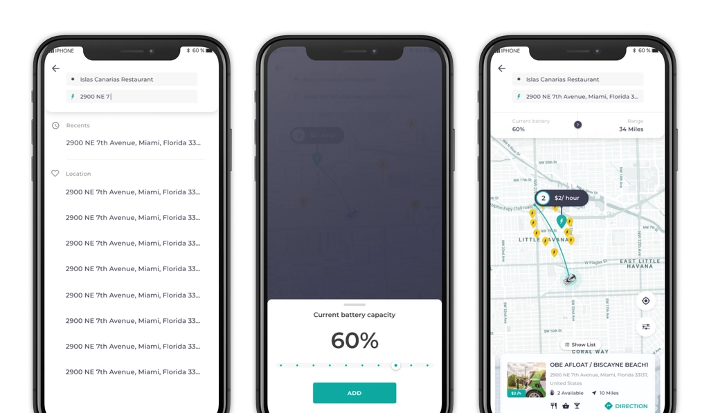
Trip Planner
A trip planner surfaces charging stops along a route automatically, addressing range anxiety before it starts.
Working Within the Design System
Obe Power's design system had to hold together three different surfaces — a consumer mobile app, a host web portal, and an admin web portal — each with a different density and audience, without fracturing into three separate visual languages.
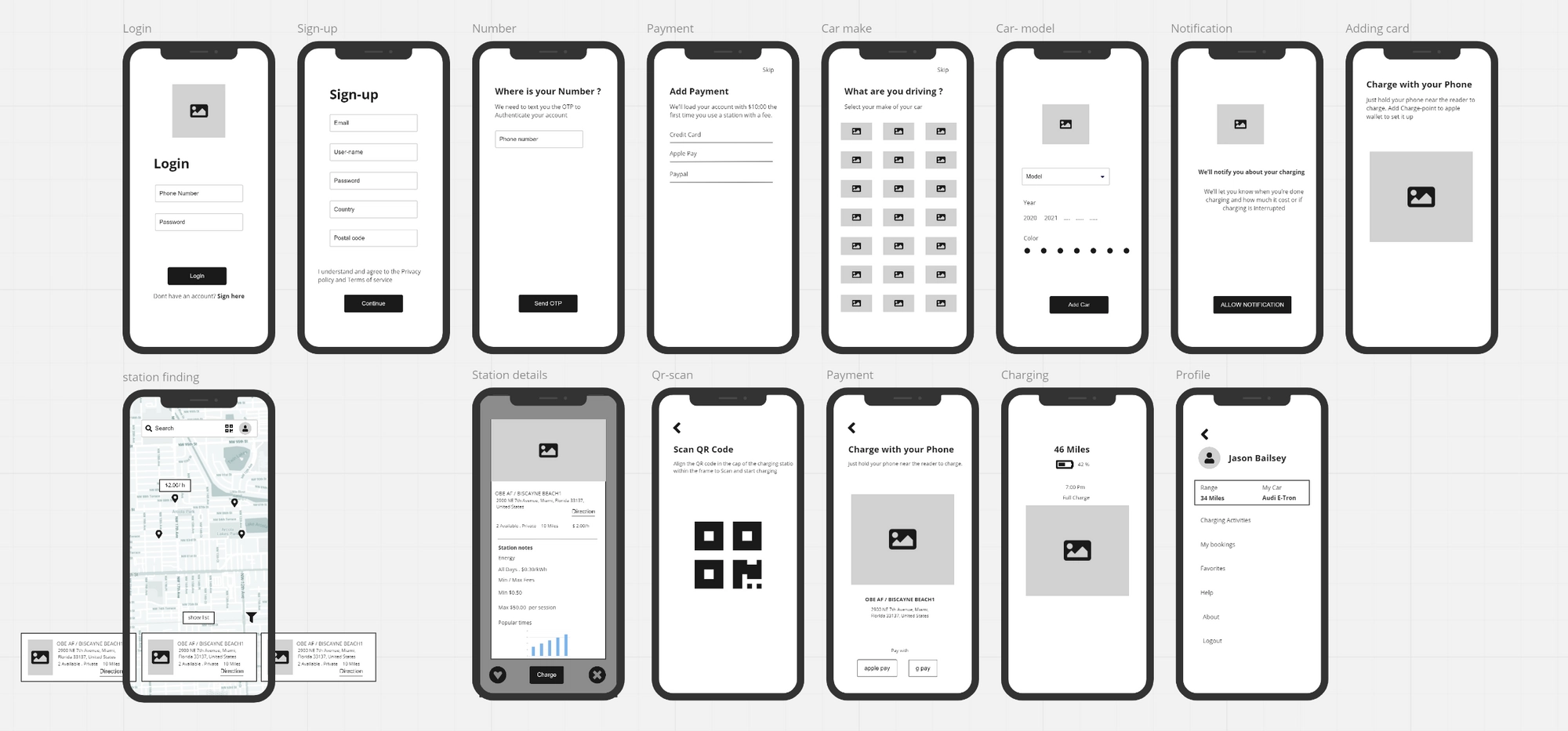
Wireframes spanning onboarding, station search, booking and account — click to view at full resolution ↗
Final Screens
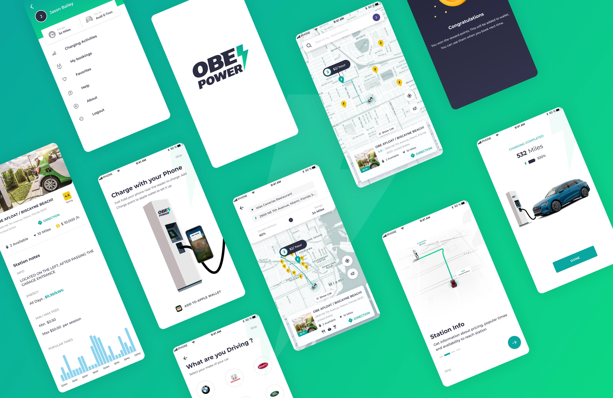
The shipped app — station search, onboarding, booking, and trip planning.
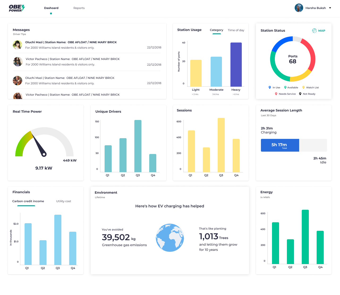
The admin dashboard — real-time station status, usage, and environmental impact at a glance.
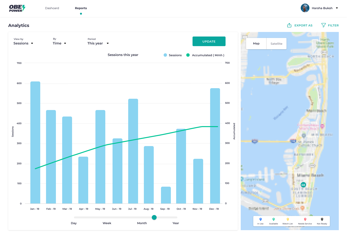
Reports & analytics — session trends and live station mapping for operations.
What Changed
What shipped, and what it changed for the people using it.
Outcome
The redesign directly supported the pitch: a single account across the charging network, live station status, and one-tap Apple Wallet payment — removing the exact friction points that were losing early adopters.
Impact
Trust in Live Data
Per-port availability and upfront pricing replaced the guesswork that was causing wasted trips.
Reduced Design Debt
A shared design system across app, host and admin surfaces cut design debt and rework by 18%.
Consistent Cross-Surface Experience
Drivers, hosts and admins now work within one coherent system instead of three disconnected tools.
A Fundable Product
The finished experience directly supported the pitch that helped secure the company's Series A.
Metrics
Before / After
The shift, summarized the same way the rest of the product experienced it.
What I Learned
Field research at an actual charging station taught me more in a day than weeks of remote interviews could have — seeing real friction, like a driver circling a lot for an occupied spot, reframed the whole problem.
Designing for three different user types on one system means the "simple" driver experience only stays simple if the host and admin tools are built to carry the complexity instead.
One car-aware detail — knowing the driver's exact vehicle — did more for trust than any amount of generic reassurance copy could have.
- Situation
- EV drivers relied on fragmented apps with unclear pricing and no live data, unsure if a spot would actually be free.
- Task
- Design a trustworthy way to find, book and pay for a charging spot across drivers, hosts and admins.
- Action
- Shipped live availability, car-aware onboarding, QR booking and one-tap payment on a shared design system.
- Result
- A single, trustworthy charging experience that helped secure a $2.5M Series A round.