P&O Cruises — Guest App
Replacing a browser-only mobile site with a real onboard app for P&O Cruises.
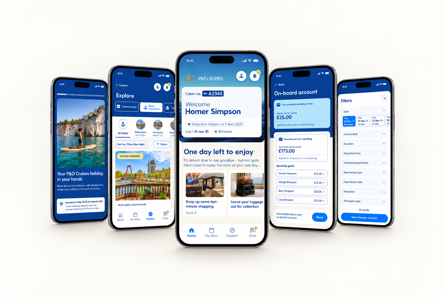
From Browser Tab to Real App
A full redesign of P&O Cruises' onboard guest companion — from a browser-only mobile site into a proper installed app covering onboard spending, dining, shore excursions, and the daily itinerary. It replaced “My Holiday,” a mobile-website-only tool with a feature set that varied inconsistently by ship. The redesign was built by a team of four designers at Carnival UK, covering account and spending, service bookings, and the day-to-day guest experience.
Who It's For
Guests on a P&O cruise — solo travelers, couples, and families booking together (relevant for the shared-vs-individual card scenario below).
The Problem
The previous tool, “My Holiday,” was a mobile-website-only experience — not a real installed app — with inconsistent features across different ships, and the daily activities programme was still handed out on paper even with it live. The most common complaint: no clear visibility into onboard spending, especially on a shared booking.
Pain Points → Design Response
| Pain Point | Design Response |
|---|---|
| No visibility into shared onboard spending | Real-time spend view with a per-guest breakdown for shared cards |
| Daily programme only available on paper | Live “My diary today” itinerary inside the app |
| Feature availability inconsistent across ships | One native app, one consistent experience regardless of ship |
| Booking dining/excursions required separate desk visits or calls | In-app booking and cancellation for dining and shore excursions |
| No quick way to check kids' club status or notifications | Home dashboard consolidating account, notifications, and services |
One of Four Designers
One of four designers (two UX-focused, two UX+UI) on this project; I worked across UX and UI. The redesign shipped after I moved to my next project, so I don't have post-launch metrics to share — this case study covers the problems solved and what shipped, not measured results.
How the App Flows
What Shipped
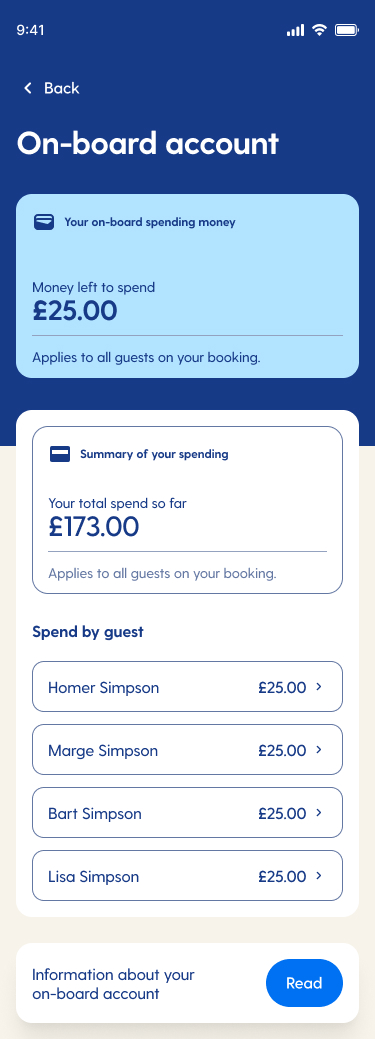
Onboard Account & Spending
Real-time spend tracking, with a per-guest breakdown for bookings sharing one card.
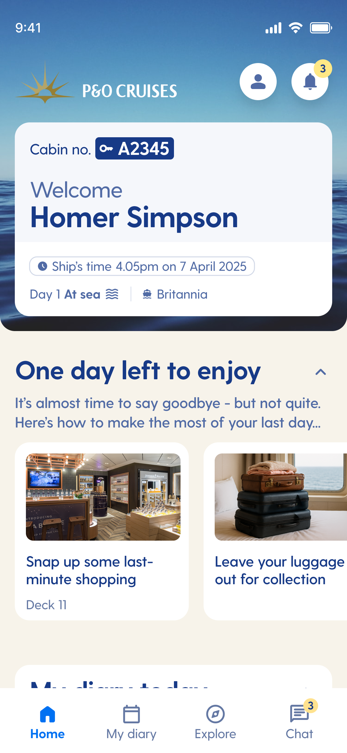
Home Dashboard
One home base for account status, today's plans, and ship services.
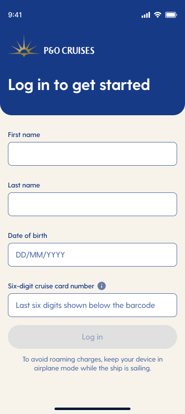
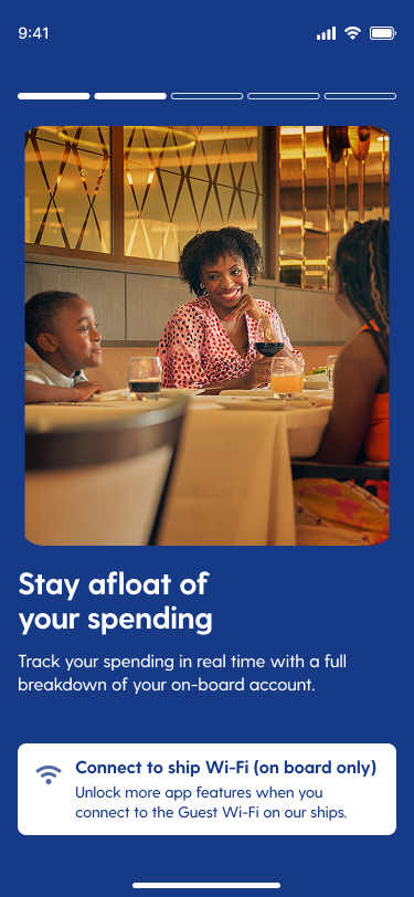
Onboarding & Login
A proper first-run flow the old browser tool never had.
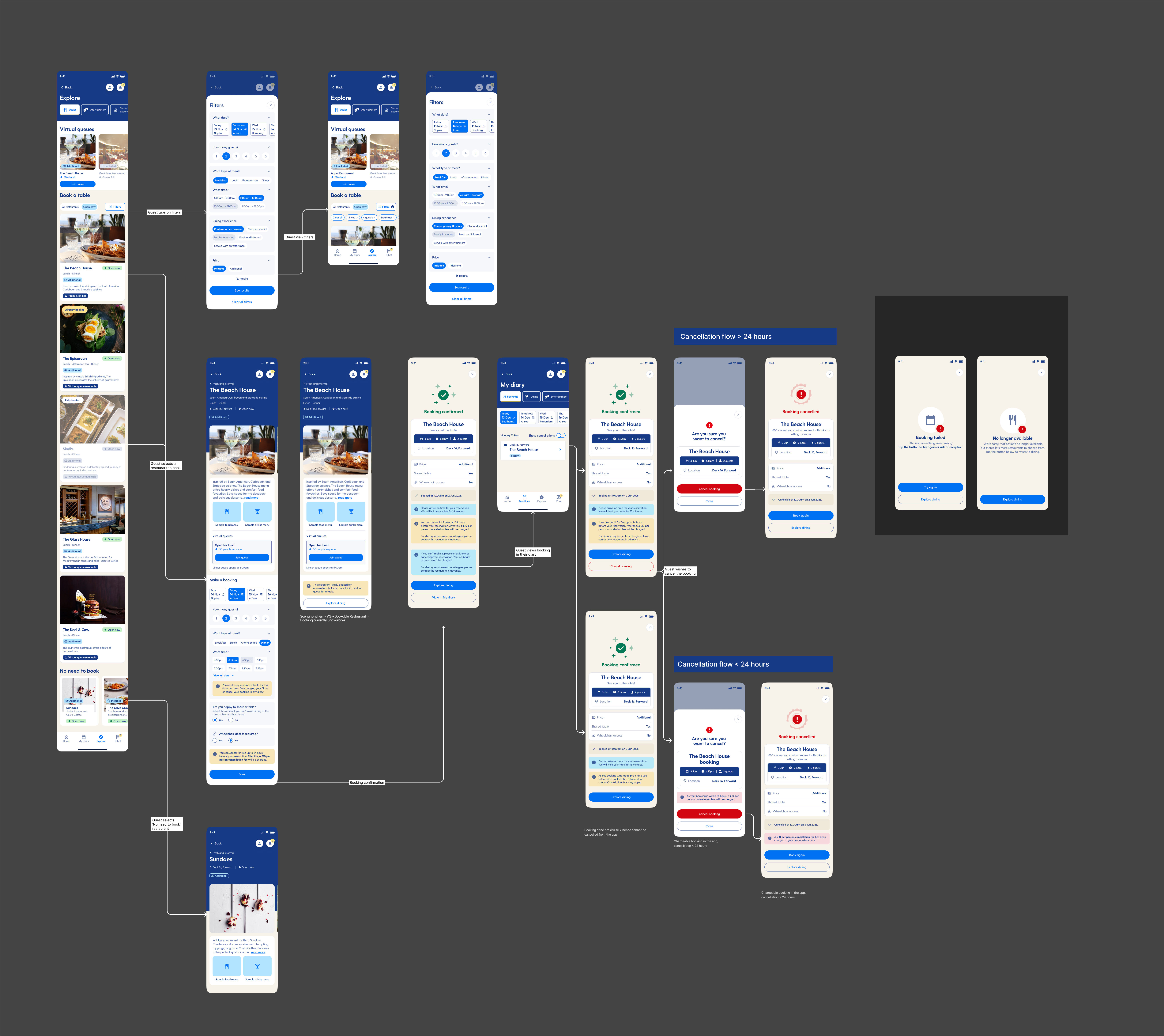
Dining Booking & Cancellation
Book or cancel a dining reservation without a desk visit.
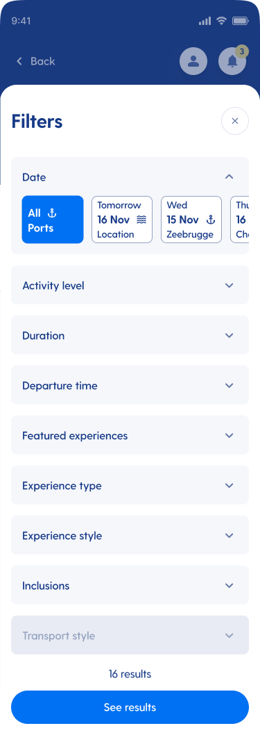
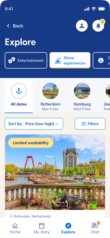
Shore Excursions
Filter and sort excursions by port.
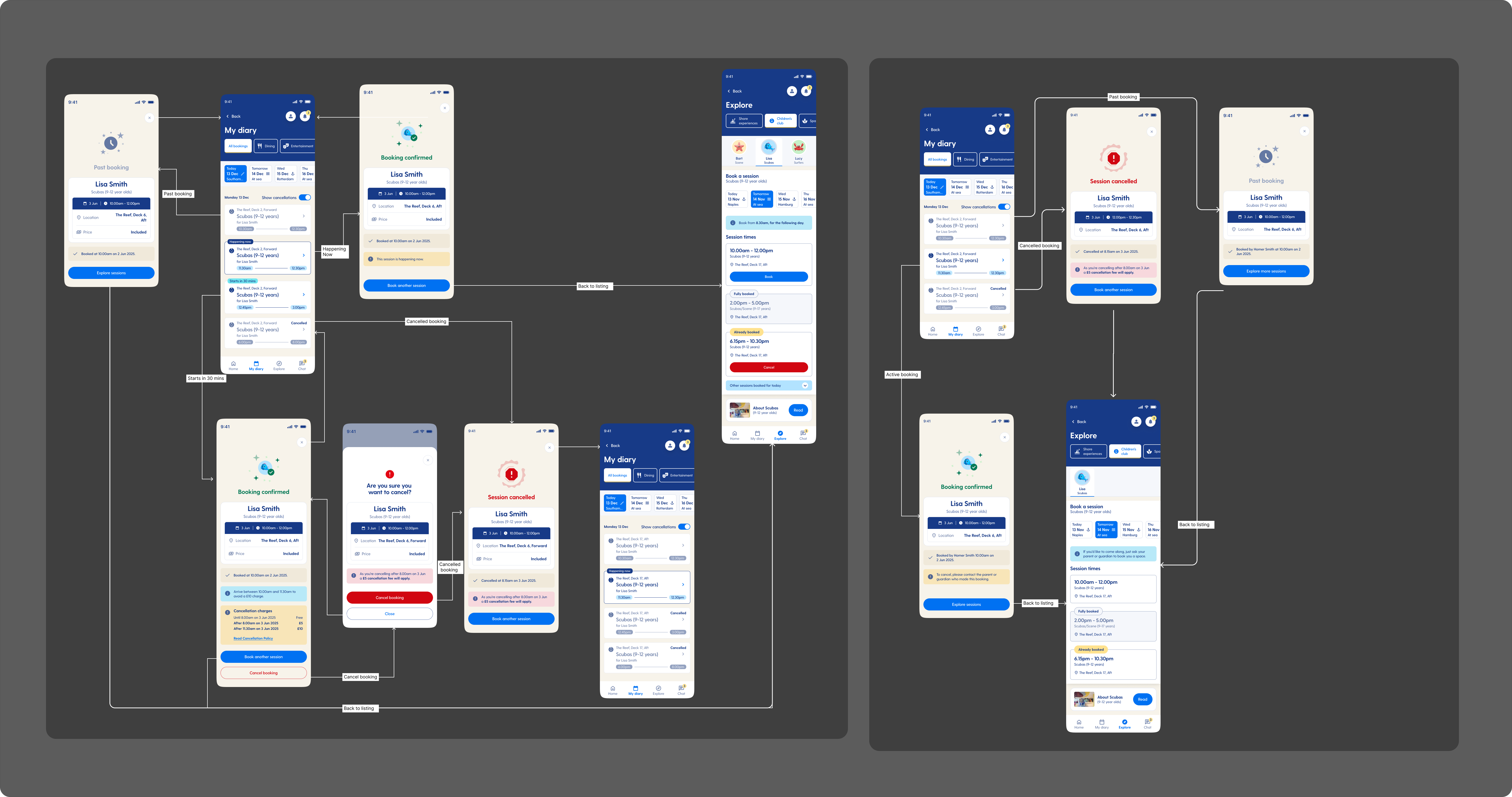
Kids Club
Check-in status and activity visibility for parents.
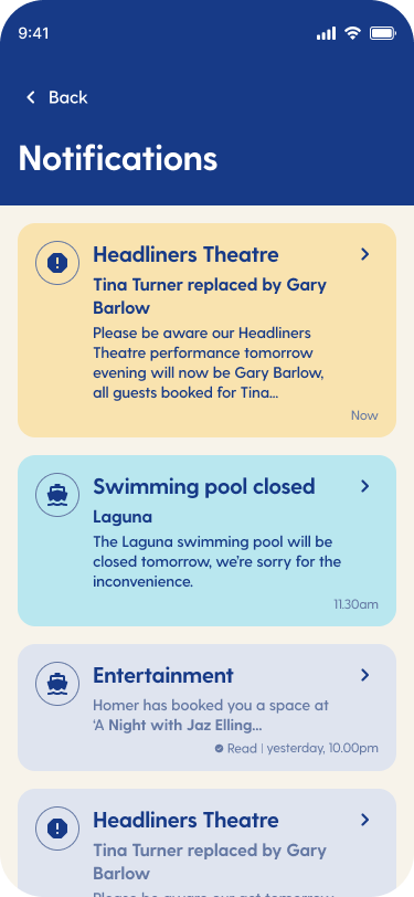
Notifications
Ship updates and account alerts in one place.
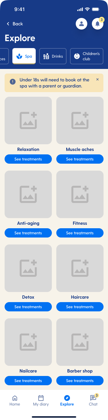
Spa
Browse and book spa services by category.
What Changed
Accessibility
Designed to WCAG 2.1 AA standards throughout — sufficient color contrast, readable type scales, and touch targets sized for use on a moving ship, not just a still hand.
Outcome
Shipped across the fleet after my involvement ended. The redesign replaced a browser-only tool with a native app experience and gave guests, for the first time, real visibility into shared onboard spending — the single most common complaint about the previous system.